Sometimes I wonder if the world has gone mad. Has the role of research created a level of anxiety in all of us? What really matters in a medical fit out? We know that a well laid out clinic design is pivotal in a successful practice, we know location and up to date technology also impacts the success of a clinic… so today we are considering – what role does the colour palate play in healthcare design?
Research shows that colour does have a significant impact on human wellbeing. Different colours can subconsciously evoke a range of emotions. Colour can affect moods and cognitive performance. Accordingly, your clinics colour palate should be a high priority during the design phase.
Let’s have a look at the basics – what does research show about colour on our wellbeing?
BLUE
Blue is a trustworthy colour – it exhibits stability, tranquillity and calm. We relate this to the sky – its forever a constant in our lives. Accordingly, blue tones promote a sense of calm and relaxation. Blue tones are very suited to psychology offices where patients respond best when relaxed.
GREEN
Green has a major connection with nature. Signifying harmony and renewal. Green tones contribute to a harmonic environment… also an environment that promotes healing and regrowth. Green tones are very well suited to most medical fit outs.
RED
Red is a strong colour. Many sporting clubs resonate red with a winning combination. It exudes energy and fire. Red is a trigger colour that stimulates an increased heart rate, it grabs attention and stimulates alertness. Red can stimulate action and progression. But be careful as red can also trigger anxiety. Proceed with caution if you are thinking of red as a hero colour in your medical fit out.
YELLOW
Yellow triggers images of the sun and is seen as a happy colour. It stimulates joy and peace within. Yellow can trigger feelings of euphoria and general wellbeing and is known to be an ‘up lifting colour’ to brighten your mood. We find yellow tones and other ‘happy; colours are often used in children’s medical fit outs like paediatricians and speech pathologist specialising in children to create childlike happiness and joy.
ORANGE
Orange like the fruit is a playful colour that is energetic at its core. Orange stimulates creativity and warmth. We see orange can stimulate communication and social interactions.
WHITE
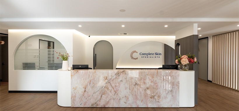
White symbolises clean and crisp. It is a refreshing and honest colour. We see predominant white wall designs in medical fit outs and dental fitouts .White is very high in the colour palate in most healthcare design..
NEUTRAL COLOURS i.e. Beige and Greys
Another very stable colour palate. Neutral colours are sophisticated yet grounded. The beige colour palate is related to nature and will inspire quiet and relaxed environments. Many medical fit outs will run down a Neutral Colour palate to create a relaxed patient mood.
THE IMPACTS ON USERS:
Subconsciously, colour does affect most people, therefore the colour palate you choose will impact your staff and patients. Taking a more in-depth look, we can see the impact of colour on:
STAFF PERFORMANCE
High on the priority is staff performance. Your workplace should elude balanced colour that are not overstimulating to ensure an optimal working environment. This helps to eliminate visual fatigue. We suggest you keep away from bright bold colours in staff zones. For example, in a dental fitout, you might consider a neutral palate with a green undertone to inspire staff to work at their optimal.
PATIENT EXPERIENCE
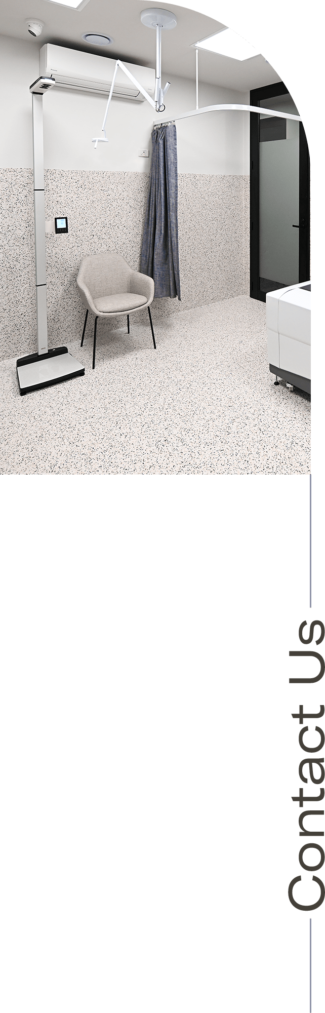
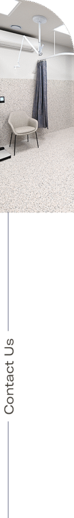
Consider calming earth-like colours like, blues, greens whites and neutrals in patient areas. These colours promote feelings of safety and healing. They can help reduce stress and anxiety and can even lower patient’s blood pressure. Consider adding a few warm colours like muted yellows, peach etc to add a feeling of friendliness and nurturing.
NAVIGATION
Bright colours that contrast can help patients find their way. If patients do not know their way around your practice, they will look for visual help. Signs that stand out will attract their attention and provide a level of comfort to the patient.
BRANDING
Choose colours that reflect your vision. Practices that specialise in children may choose brighter colours for branding to feel childlike and friendly, yet a dental fit out might re-brand themselves using a neutral or blue palate to elude trustworthiness and cleanliness.
As colour has a direct impact on peoples moods, please ensure you consider the colour palate and the impacts on your stakeholders during your healthcare design phase.
We would suggest you partner with a medical design specialist to ensure the impact of colour on your medical fit out is considered to the fullest.